Complex layouts adapting between breakpoints
05 / Featured case studyWordPress · WPBakery
SaaSPlatform.
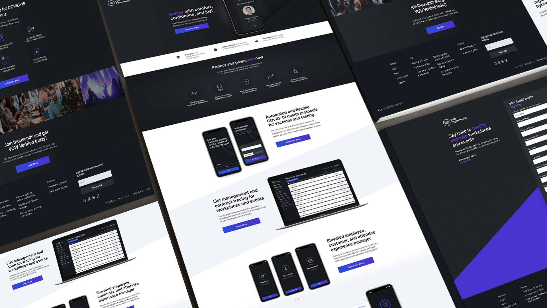
A high-fidelity WordPress implementation for a SaaS platform, built from detailed Figma designs.
01 / Project overview
Detailed designs.
A dependable website.
This project involved developing a marketing website for a SaaS platform from supplied Figma designs.
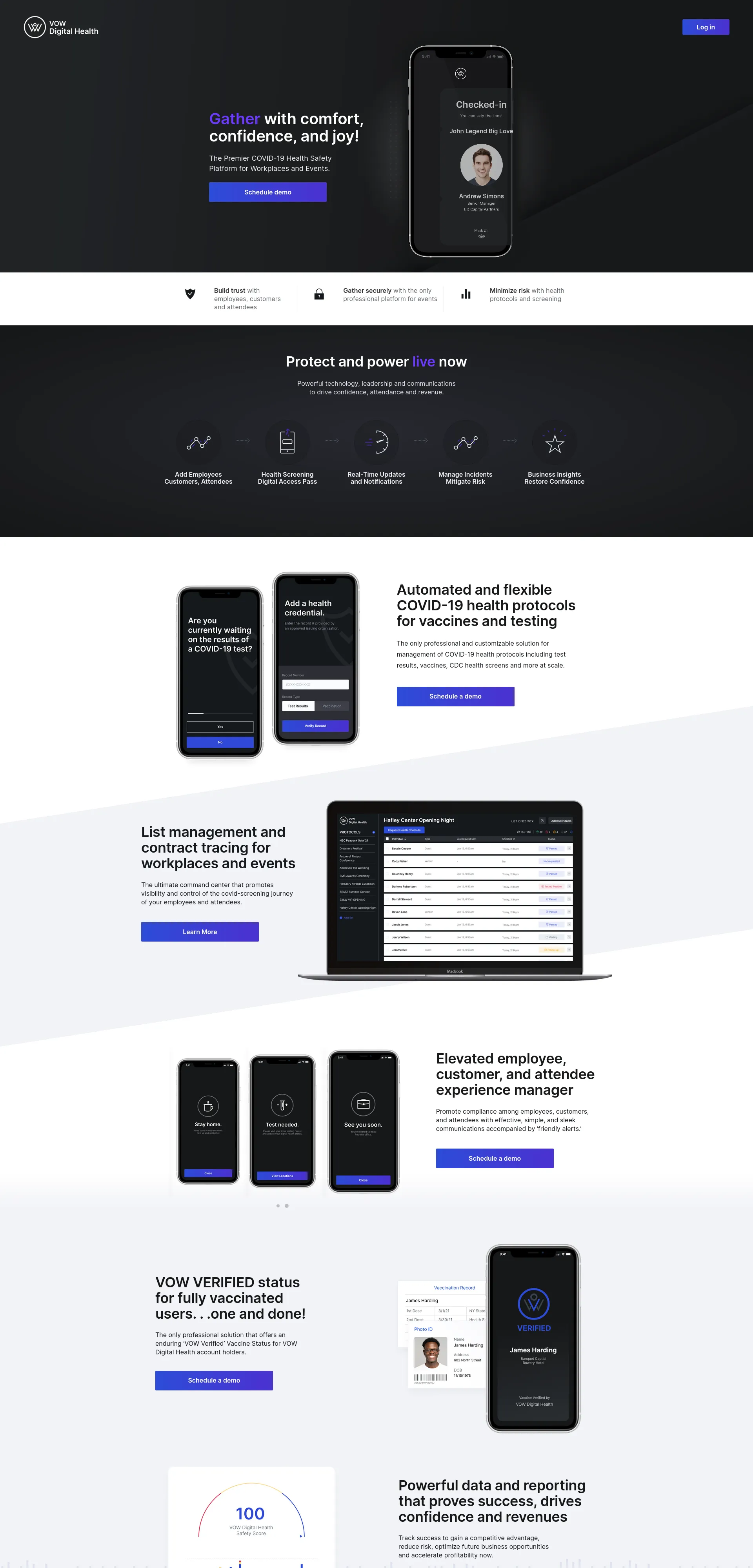
The visual direction was closer to a modern software product than a traditional corporate website, with structured sections, application-inspired interfaces, custom layout behavior, and consistency across desktop, tablet, and mobile.
Our role was to translate those designs into a production-ready WordPress implementation while preserving design fidelity and avoiding fragile page-specific fixes. The internal team also needed the flexibility of WordPress for ongoing content management.
Preserve the design.
Interpret the behavior.
Protect the system.
02 / The challenge
A screenshot shows a state.
The website needs rules.
High-fidelity design-to-development projects can look straightforward from the outside.
A design file shows how a page should appear at a particular screen size, but it does not define every behavior required once the website becomes responsive and interactive. The objective was not simply to reproduce screenshots; it was to interpret the design system and turn it into a stable website.Repeated interface patterns remaining consistent
Responsive spacing and typography
Custom frontend code where needed
Visual accuracy without fragile fixes
Performance within the existing WordPress stack
03 / Development approach
Find the patterns.
Then build the pages.
We identified the visual and structural patterns repeated across the Figma designs before implementing individual pages: spacing, containers, typography, responsive behavior, reusable components, breakpoint logic, and application-style UI patterns.
WordPress as the content layer Extend the stack.
Do not fight it.
Do not fight it.
WPBakery remained part of the existing content-management environment. Where its controls were sufficient, we worked within them. Where the designs required greater precision, custom HTML, CSS, and JavaScript bridged the gap without an unnecessary rebuild of the existing stack.
01Figma implementation
02WPBakery customization
03Reusable layout patterns
04Custom frontend code
04 / Application-style interfaces
A product story
that behaves like a product.
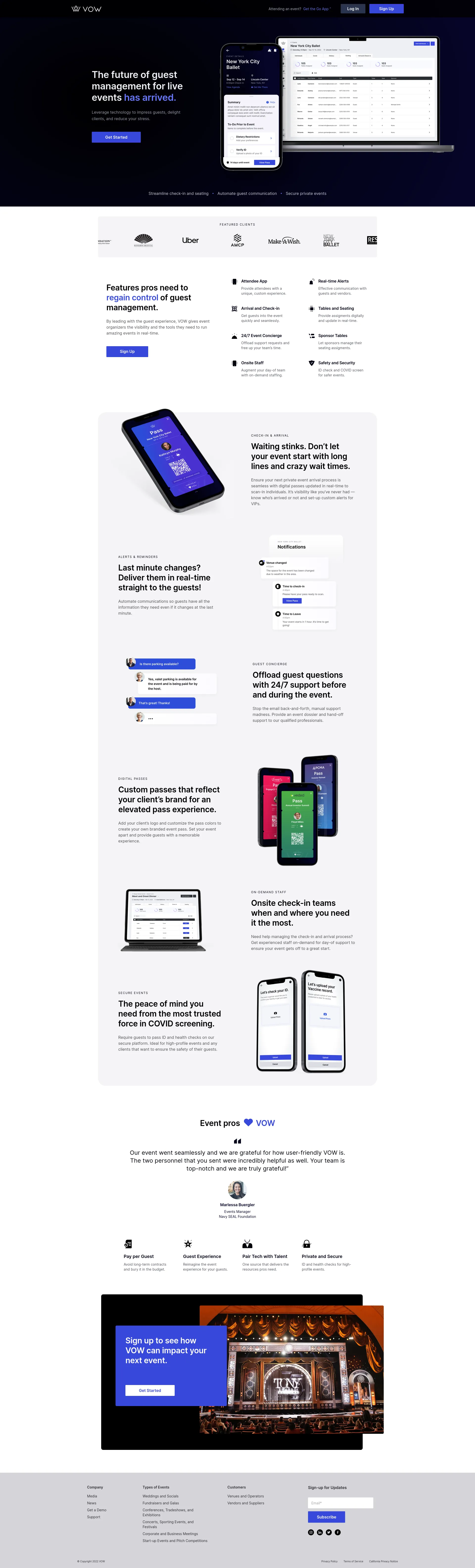
The site visually represented a digital product. Its UI patterns needed to feel more like an application interface than a conventional marketing page, while remaining aligned and understandable across screen sizes.
Hierarchy
Responsive rules preserved the information hierarchy and usability between the supplied desktop and mobile designs.
Interface language
Application screens, controls, devices, and feature explanations share a coherent visual grammar.
Editorial control
WordPress remained the content-management layer without allowing page-builder constraints to dictate the final design.
05 / Responsive interpretation
Not a smaller desktop.
A considered mobile state.
Static designs showed the intended desktop and mobile states. Custom responsive rules defined what happened between them, preserving hierarchy, usability, and visual balance rather than simply making the desktop layout fit on a smaller screen.
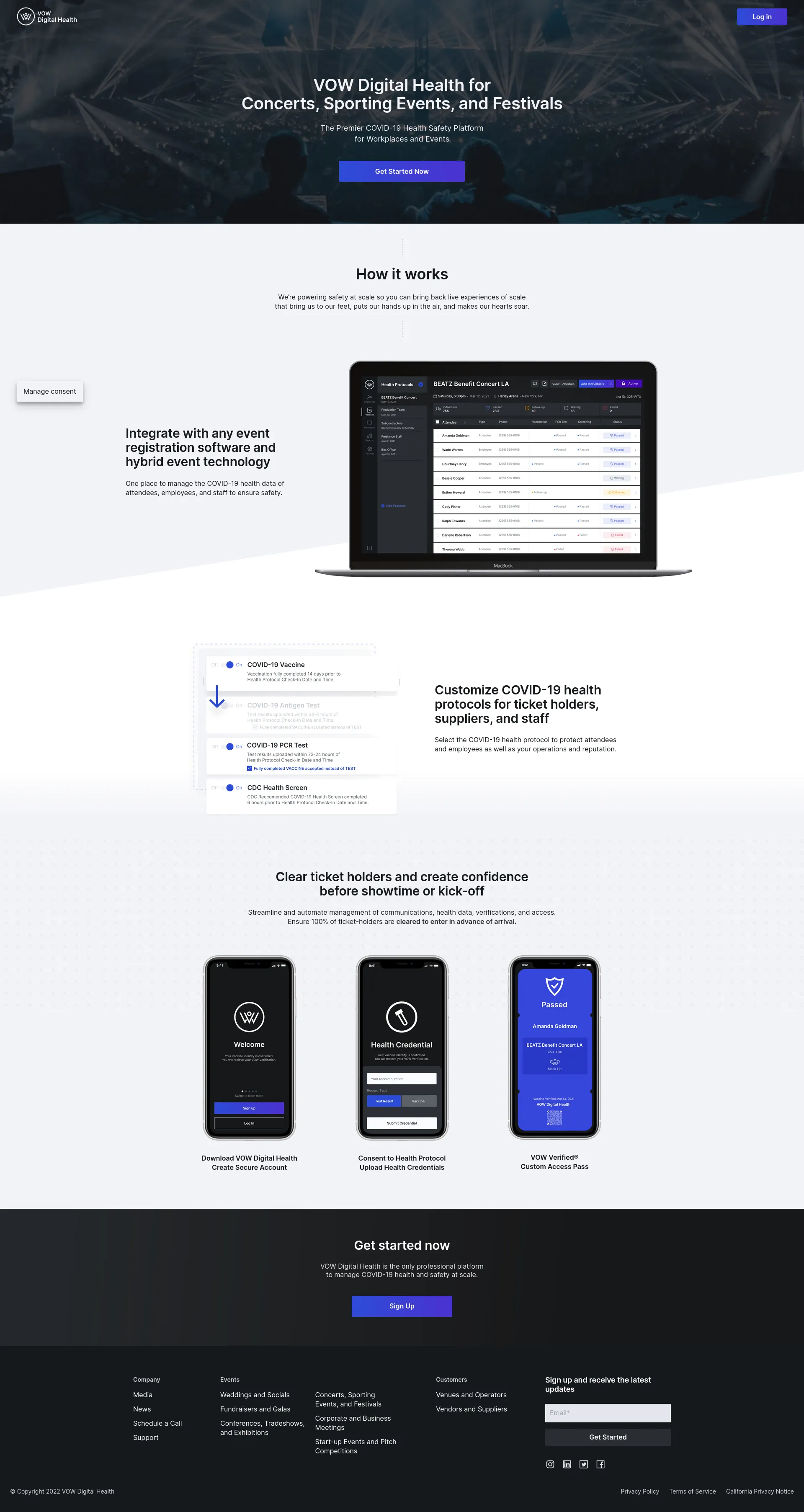
Desktop composition.
Responsive systemSpace supports product explanation and a clear sequence of features.

Mobile composition.
The same content is reordered for a narrower, more linear journey.
06 / Design fidelity
Accuracy through
repeatable decisions.
Spacing relationships, typography, component dimensions, section alignment, imagery, responsive transitions, and visual hierarchy were handled as shared rules. Identifying recurring patterns reduced the chance of small visual differences accumulating across the site.
TypographySpacingComponentsBreakpointsVisual hierarchyImage behavior
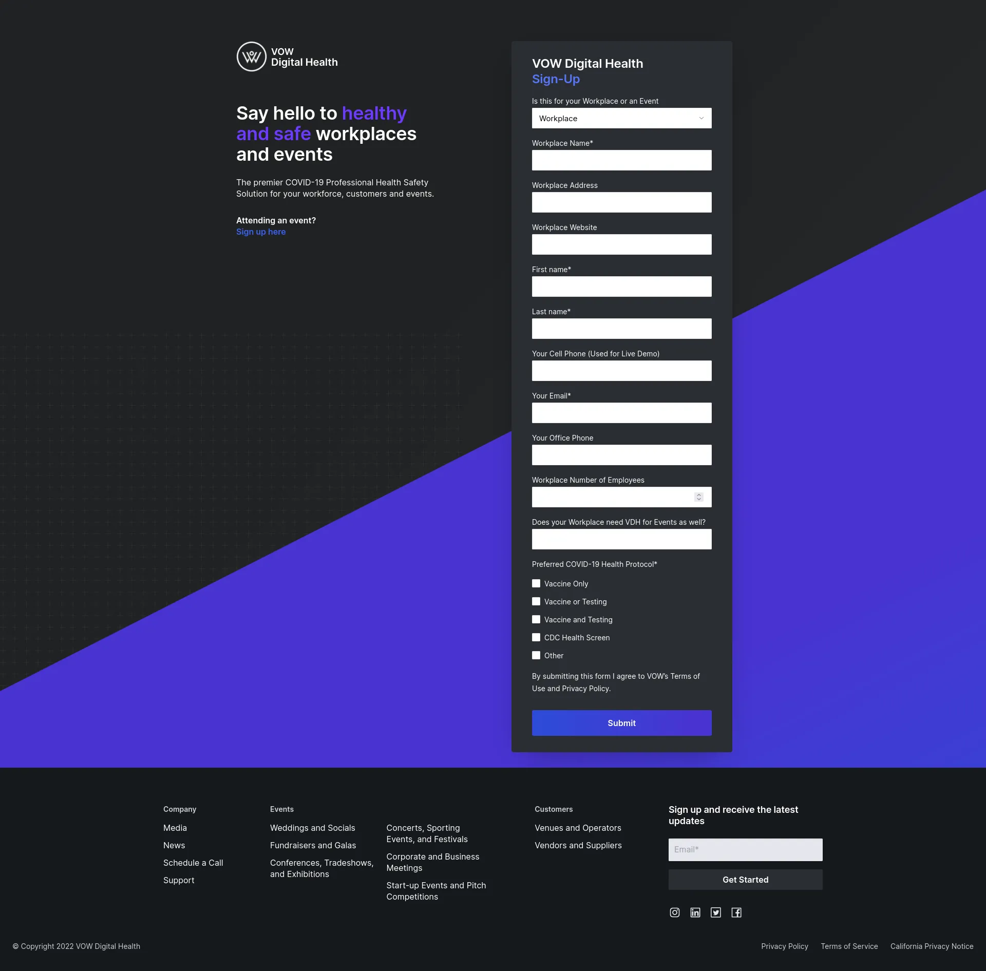
Conversion without visual drift.
Design fidelityBrand, content, and form functionality remain part of one system.
07 / Complete implementation
The full journey.
Nothing hidden.
Detailed Figma layouts were translated into a responsive production website without reducing the design to generic WordPress patterns. Repeated structures were built consistently so future edits would not require rediscovering how each page was assembled.
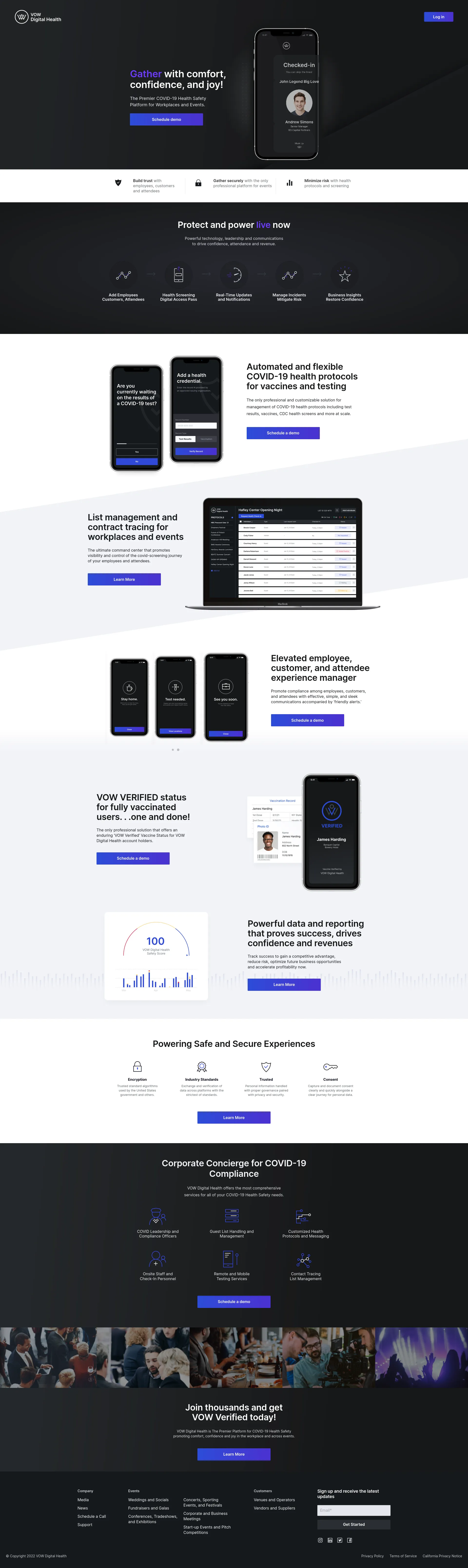
Production-ready WordPress.
Complete implementationFigma fidelity with a maintainable content structure underneath.

The complete mobile flow.
Content remains clear through a substantially different screen proportion.
Responsive refinement
Every layout needed to remain understandable—not merely fit.
Content stacking, section spacing, typography scaling, image behavior, interface-style components, alignment, breakpoint transitions, and mobile readability were tested and refined.
08 / What this demonstrates
Fidelity at launch.
Stability afterward.
Interpret the design system
Detailed Figma layouts became responsive rules rather than isolated recreations.
Extend an existing stack
WPBakery remained part of the implementation while custom development supplied the control its standard tooling could not.
Protect performance
Focused code and deliberate responsive behavior avoided unnecessary frontend weight during implementation.
Keep content manageable
Recurring structures were implemented consistently to support future edits and ongoing content management.
Balance real constraints
Visual fidelity, editorial flexibility, and technical stability were treated as equal requirements.
09 / Technology & capabilities
The implementation
behind the interface.
Platform
WordPress
WPBakery
CMS-managed content
Development
HTML
CSS
JavaScript
Custom scripting
Implementation
Figma implementation
Reusable layout patterns
Responsive typography
Breakpoint refinement
Focus
Design fidelity
Responsive behavior
Frontend performance
Maintainability
Application-style interfaces
← Back to selected work Detailed designs.
Figma to WordPress development
Detailed designs.
Built to last.
Design fidelity and responsive WordPress, built for the team behind it.
Let’s talk about your next build.